Friday, February 29, 2008

Video Copic Tutorial #4 Tye-Dye Friday


Tonight I went to see 'The Other Boleyn Girl' it was WONDERFUL! I highly suggest it if you like great tragic films. Anyway, I am getting the hang of this video thing and I learned how to add titles and subtitles to my tutorials! I know last Tye-Dye Friday I showed a tye-dyed flower stamp, well this friday I am showing you how to do the same technique with different colors on VIDEO!!! Please enjoy the show!

ScrapStamper Video Tutorial Episode 2


I have a lot to do this weekend, I have a test on Tuesday, a paper due Tuesday and another final report due Tuesday. However, it’s Friday so my motivation levels aren’t so high for those tasks. Also I’m sore from the gym yesterday (insert angel halo here lol).

So I decided to do another Video Tutorial! Do you all like these better or worse than regular picture tutorials? Next week I’m hoping to play with my sister’s macbook to learn how to subtitle and edit them, I tried in Window’s Movie Maker but I can’t seem to figure out how to save them as AVI files (a YouTube compatible file). I tried Auto Focus today and my camera still is going a little bit crazy, any tips??? This blog thing really is a learning process, but so far I’m having a ball!

Ok so back to this tutorial! I love House Mouse stamps, especially when it comes to Copic makers. Their detail makes it really easy to color them, which is why I have chosen them for this segment 

Also...get ready for a late tye-dye Friday post with a VIDEO! tutorial on how to tye-dye and glitter a very cute flower for a thank you note :)

My Very First Video Tutorial


Please enjoy my first video tutorial utilizing copics! I had my camera on Macro Focus, which is why it seems to be going a little crazy, my next tutorial won't do this :)

Thursday, February 28, 2008

Late Nights, Early Mornings and the agenda that tells me when to do which


Oh College…I managed to stay up until 2 am last night studying African Politics. The good news is I really feel like I know and understand the information, the bad news is that I am wicked tired. I have 9 hours of class today, so I thought I would post something collegiate in honor of my exhausting day.

My Planner! This was the cover of my agenda book last year. It was made with 3 different Quickutz fonts, Marissa Mini, Studio Classic and Ginger Mini. I used some random orange ric-rac from my lss, three orange eyelets for design balance (it grounds the weight on the right) and a print out from the internet. I also used some rub-ons from Quickutz. This technique-free quick project is all about design elements, color and simplicity. Ok, now back to my Political Theory lecture on Locke. :)

Wednesday, February 27, 2008

Cold Weather and Yummy Coffee


Brr…it’s cold!! Although, probably incomparable to your weather, Gainesville got very chilly overnight. Yesterday was one of those gross humid Florida-can-get -yucky days. However, today is one of those Do-I-really-live-in -Florida-my- uggs-are-cozy days.

I have a big test tomorrow for my African Studies class, so I’m a little stressed. I’ll get by with a little help from my friend, COFFEE! I am a total coffee nut and in honor of the weather I thought I would show you my coffee mug.

I tend to be on the go a lot, so I usually take my coffee to go. This handy mug was made with 6 Quickutz fonts and a large flower stamp. I colored the stamps with my prisma colored pencils. Well I’m off to read about Sierra Leonean politics, doesn’t that sound like fun?

Tuesday, February 26, 2008

A little bit about me :)

I am a full time student at the University of Florida. I am going to be graduating a year early, with a degree in Political Science and minors in Environmental Science and African Studies. I have a real passion for scrapbooking, rubberstamping and being creative. Unfortunately, due to the constraints of dorm living, I am seperated from my craft supplies. Thus I find myself producing 20-30 cards in a weekend, when I go home to visit! I started working at a Scrapbook store at the age of 13 and I still work there when I go home to miami!

Have A Super Birthday!


Last month I ordered 100$ worth of Bellas. I had been waiting to place a larger order, as for some reason shipping (everywhere) always bugs me. One of the Bellas I purchased was this SuperBella. What actually convinced me to buy it was the awesome saying 'Have a Super Birthday'. How cute!

I used my copics to color her and I even used a copic spica for her blouse. You can really see how much glitter the pen packs in the close up above. I also used my copics to color the bauble to match. I really love that matchy look. The background paper is actually cheap-o from a Mike's superpack probably three years ago.

I tied it all together with a ribbon! What do you think?

Monday, February 25, 2008

An Apple A Day Tutorial!

I am really loving my new found need to play with photoshop! I think I am getting better at fixing my pictures and I am even learning better ways to take them. Blogging is definitely an eye-opening experience from working out in words how you create to seeing how many people view your blog across the world. As a political science student, this is truly fascinating to me! So on a much lighter note, here is my copic tutorial on shading apples.
Step One: Gather Image. Stamp in Adirondack Pitch Black on Geogria Pacific Paper.

Step Two: Lay down your initial colors. I used R14, G40, E33 and YR31 for my first layers. I was able to everything you see above just by layering these colors. I would let it dry and then come back to it. The shading of the image helps, but I always try to remind myself of where the light is coming from, in this case the upper left hand corner.


Step Three: Add your darker colors. For me this include E37, G27, R27, R29 and more coats of Y31. I used Y31 over the entire basket to unify the colors.

I really love this image!

It's a Small World After All

This is a really simple page that I made about Grad Nite. Disney hosts a Graduation Night for Florida Seniors. It's open all night and every grad gets to play at the park. They have Mickey dressed in a gown and other fun decorations. They also have live bands scattered through the park!

Now, about the page :) The paper is bazzil-which is my absolute favorite for scrapbooking. I used the hero art stamps for the 'live laugh love'. I embossed it in white in the right hand corner.

I also cut out parts of some Disney paper for the border. I also used my Fasentator (EK!), for the mickey staplers. The Fasentator is a great and flexible tool which staples wide staples!

On another aside, I just wanted to let you all know how much I appreciate you coming, looking and even learning here!

Sunday, February 24, 2008

Love is all you need!

This is a one of my favorite projects! I got this frame from one of my friends about 4 years ago. I instantly knew I wanted to decorate it and put it in my dorm (mind you I decided this before I even took my SATs).

So here it is! Done! I decorated it with pictures of my family and friends as well as some quotes about life and love.

I also used my wishblade to cut out the gigantic word 'Love'. The Wishblade is really a great tool for decoration. Especially when you have a TON of white wall space to work with. I ended up cutting out other messages and putting them around my room. I used inspiration words such as, Smile, Believe, Love and Create. I really love how it all turned out.

Saturday, February 23, 2008

Carpe Cupcake

This is a fun and quick card with Hero Arts Clear Stamps. The sentiment, cupcake and candle come together with a bunch of cute sentiments and more cupcakes. It is a fun and playful set so I chose some fun colors, Y13, Y15, B01, B13, V000.
I find it really nice to just do a simple card sometimes, three layers maxium no out-there techniques. Just some coloring and cutting, while letting the adorable image come into it's own :)

Friday, February 22, 2008

Tye-Dye Friday!

In high school, we used to have Tye-Dye Fridays, where everyone would dress very casual usually with something tye-dyed. I figured I would celebrate this on my new blog, every Friday I hope to showcase some sort of tye-dying technique, from copics to brayering.

Above is our finished project :)


Step One: Gather a bunch of Bright colors. These tend to dye the best because of their darker ink. Also choose a fun stamp that is wide and not very intricate.


Step Two and Three: Dot your image with all of the different color markers, vary how much space is in between the various spots of color for a more uneven look. Take you 0 colorless blender and really push against the coloring in a circular motion. Immediately, you should see the color dispersal. You can continue to push againest the paper for as long as you want to get your desired affect.


This is what your image should now look like. Notice the holes in color...


Step Four: Choose lighter variants of the aforementioned colors.

Step Five: Fill in the color gaps with these markers.


Step Six: Repeat the pushing with the 0 Colorless Blender until your desired effect is achieved.


Completed! This is not a perfectly neat technique. The color will tend to bleed out of the lines. There are a few solutions to this, outline in a darker color (i.e. where I put light purple you could put dark purple or blue), cut your tye-dye image out and paper piece or you could even leave it as it highlights the funky effect. Again, my theory with art is that your neatness level should reflect your piece. For this flower I wanted it to be funky so even my cut out of the circle is a little off the center :)

Hope you enjoyed it!

Thursday, February 21, 2008

Shopping List

When I first came to college, I discovered that when away from home, food stops magically appearing in the pantry and on the dinner table. I therefore decided to make a fun, cute and functional shopping list. I created that backdrop and then I Crop-a-diled about 50 sheets of paper with three eyelets. I am able to rip off my list each week! I used the Quickutz font Maggie to cut out the word ‘Shopping List’. I also used a colorbox ink (light yellow) to lighten the blue background.

Wednesday, February 20, 2008

1 Pen, 2 Layers

Good Morning! Copics are obviously a pretty large investment, given the fact that they retail for 5.99 and it is suggested that one purchases three varients of shades for each 'color'. This is due to the fact that the gorgeous look one recieves is mostly from the layering of color, rather than the blending technique. I have found that three varients of color is not always necessary. Certain colors, such as RV 14 Begonia Pink, layer particularly well with themselves making it unnecessary to purchase the three variennt shades (which would be RV12,14,16)!

Step One: Choose Image. I think this girl is so adorable for anything from a good report card to a shoot for the stars greeting!


Step Two: Start with the first layers. For stick drawings, such as this darling girl or bellas, I tend to outline the 'stick limbs'. I think it gives her more dimension!


Step Three: Use R20 to make circluar blush on her checks (it makes it look a little more cartoonish but I think in a cute way). Lightly color R14 over her dress, put more pressure around the edges of her dress.

Step Three: Wait 20 seconds. Put your second layer (or third or fourth!) of RV14 on the corners and outline of her dress. Your image should show the layers like above.


Finish your image! Since she is such a playful image I kinda went with that theme for my coloring. Notice how the coloring is not perfect, the star's shading is not totally even. Its always fun to adapt your style of color for a certain image, if its childish, a gorgeous flower, or a birthday cake, your colors and style should reflect that!

Tuesday, February 19, 2008

Georgia Pacific Paper

Someone emailed me earlier asking what kind of paper I use with Copics. I am in love with Georgia Pacific! Who knew the same people who make paper towels and their dispensers would make such a yummy paper. The markers seem to glide, blend and play with ease on this inexpensive (I believe 5.49 for 150 sheets) 110 pound paper goodness!

What type of Ink is best with Copics?

A panicked stamper is what many a novice copic colorer has turned into when they first dabble with the markers. The reason? Smeared Ink! You see, copic markers are alchohol based and many types of ink are sensitive to them. Therefore my overwhelming suggestion is to invest in an Adirondack Dye Ink Pad! Many people have found success with Brilliance inks and also Stazon for their copic adventures, however I personally like 'blackness' (more technical jargon haha) of this particular pad.

I'm Gonna Be a Gator!

This is a quick and old layout. I really like the simplicity of the Orange, Blue and White. This is such an easy page with a Quickutzed title. I actually made this page the day I got on December 4, 2005 as memorialized in the corner of the page. That's one of the best things about Scrapbooking, the memories it explains and keeps.

Ingridents: Paper and Stickers by Sports Solutions, Die cuts: Quickutz, Studio

How to Clean a Copic Mistake

Step One: Make a Mistake! Check. Done. See aforeposted (I know its not a word).


Step Two: Lightly use your Colorless Blender 0 to tap and swoosh towards you (technical jargon lol), by gently rubbing the tip of your copic sketch with the paper and lifting away from the paper. Repeat. Many times. Oh and as an aside, I seem to be getting better with the camera and this picture shows alot of the detail in the coloring, especially the Mouse's blush.


Step Three: Watch the color fade. Tap and Swoosh. Move on to the next part of your coloring. Return to your mistake. Tap and Swoosh.


Step Four (optional): If your mistake was like mine, dark and rather larger, you may want to turn your paper over and repeat the tapping and swooshing.


Step Five: Smile at your almost completely faded mistake!

Some extra tips: Remember, you are using a blender and it likes to disperse color. Be careful not to touch any of your colored image with the blender, as it will drain the color and give it a tye-dyed effect (fun technique, when intentional, maybe tomorrow's tutorial HINT HINT!).
Do not give up! I have found that 95% of my mistakes will come out, after much tapping and swooshing.

ElyBlair

Monday, February 18, 2008

Just a Quick Post

Firstly, I am overwhelmed by the response to my blog! Thank you! Thank you! Thank you! As a new blogger, I am obviously working on setting up the structure of the website. I want to link to all types of stamping blogs, the ones all of us love and treasure daily AND the ones we all would love and treasure daily....if we knew about them. SO...email me (or comment) a link to your blog. If and WHEN I love it....I will link it here :) ETA: I have added those who have commented so far, and I will continue to add links. If you like my blog, I would also appreciate if you could link to it, though it is not necessary and I will still link to you :)

Happy Birthday House Mouse


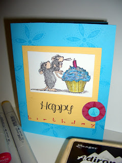
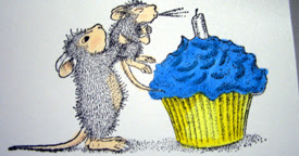
Above is the card we are about to color!


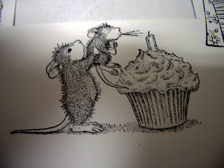
Sorry about the poor quality of this image, I am getting the hang of the camera. One of my favorite things about HM (House Mouse) stamps is the fact that the shadow is already shaded. We will use our darker copic for where the black is heaviest, giving us an easy way to learn how shading works.

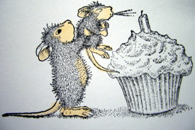
I began by using EOO and R20 for the mice. I just hinted at their checks with the R20 while steadily making their limbs E00 with just a tinch of R20 for shading. Below you will see my formula for these mice.

My all time favorite yellow combo is Y13 and Y15. I think it is a great 'pop' color. Again I used the Y13 over the whole image, then I 'shadowed' with Y15.

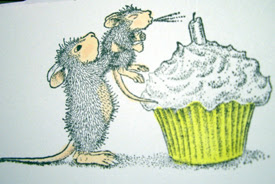
Frosting is always fun, and in this particular stamp the key to making a boy or a girl card. Betcha never though frosting could set a mood! I used B14, then B05 and made my darker shadows with BG09. Next I used my colorless blender to smooth out the color from the BG09 (you can see the realization of this below).

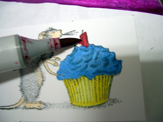
This candle is quick and I used R27 and R29. If you look closely you can see that I made a mistake coloring the side of it and went out of the lines (I actually did this while trying to balance the clipboard, marker and my camera. Typical!) Tomorrow, I am going to show you a quick way of fixing this common mistake.


Next, I went back and shaded the wrapper a little more with Y17. Extra layers of the same color can really add umph without costing big $$.


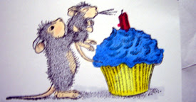
You can see my mistake starting to fade with my trick (TBAT to be explained tomorrow). You can also see the first layer of C1 on the mice.
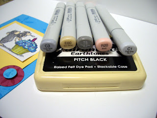
I have about 4 or 5 color combos that I like to do with these mice. Above is my favorite combo and also the one that I used on this card.


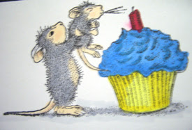
And of course the finished card.

Ingredients: Tempting Turquoise SU! paper and ink, Rose Red paper and ink SU!, House Mouse Stamps, SU! stamps, EK Sucess Stamps.

Thanks for reading! I am new to this so all criticism and comments are appreciated :) I promise to improve the quality of pics next time!